

I love exploring bookstores. Not simply because I’m a writer and I look forward to one day have my published books in bookstores, but because I love books and there’s nothing like stepping into a retail space whose entire role is to get you distracted, interested, inspired, and entertained.
As a retailer, I find bookstores a visual delight. Books are one sector of retail sales I know little about, apart from an array of art or gift books sold in the different brands of my past lives. I know the minimums are high and the lead times are long, while the pricing is essentially set at keystone, maybe $1-$5 more than MSRP at most, depending on your demographic, neighborhood, competition, and what you think you can get away with charging. Also, books are heavy which affects shipping. Logistics aside though, bookstores are excellent studies in visual merchandising because no two stores do it the same way.
Some stores do a rack of “staff favorites” or “current top ten/twenty”, which is then double-exposed with fiction and non-fiction. Perhaps there’s a table or end cap with literary titles that are current films (Wuthering Heights, The Odyssey, Pride & Prejudice, etc), or suggested titles based on a trend: “If you loved Widow’s Bay you’ll love these…” Of course, plenty of stores keep it very simple with large bookcases of the newest releases, divided only by non-fiction and fiction. It’s basic but it works, and that way the book covers can do the work.
Wisdom tells us not to judge books by their covers but we do and it’s not a moral failing — it’s actually what we’re meant to do. The book cover is the advertisement of the content inside, a visual representation of the story in one image. It should intrigue, provoke, romance, and give you some kind of idea of the story you’re going to read. In fact, there’s a whole science to book cover design…but more on that later. The point is, book covers are meant to be judged so that the books sell; they are one-item marketing campaigns whose sole purpose is to get you to take it home with you. Yes, book shopping is like a dive bar on a Friday night, but usually with better results. Mostly.
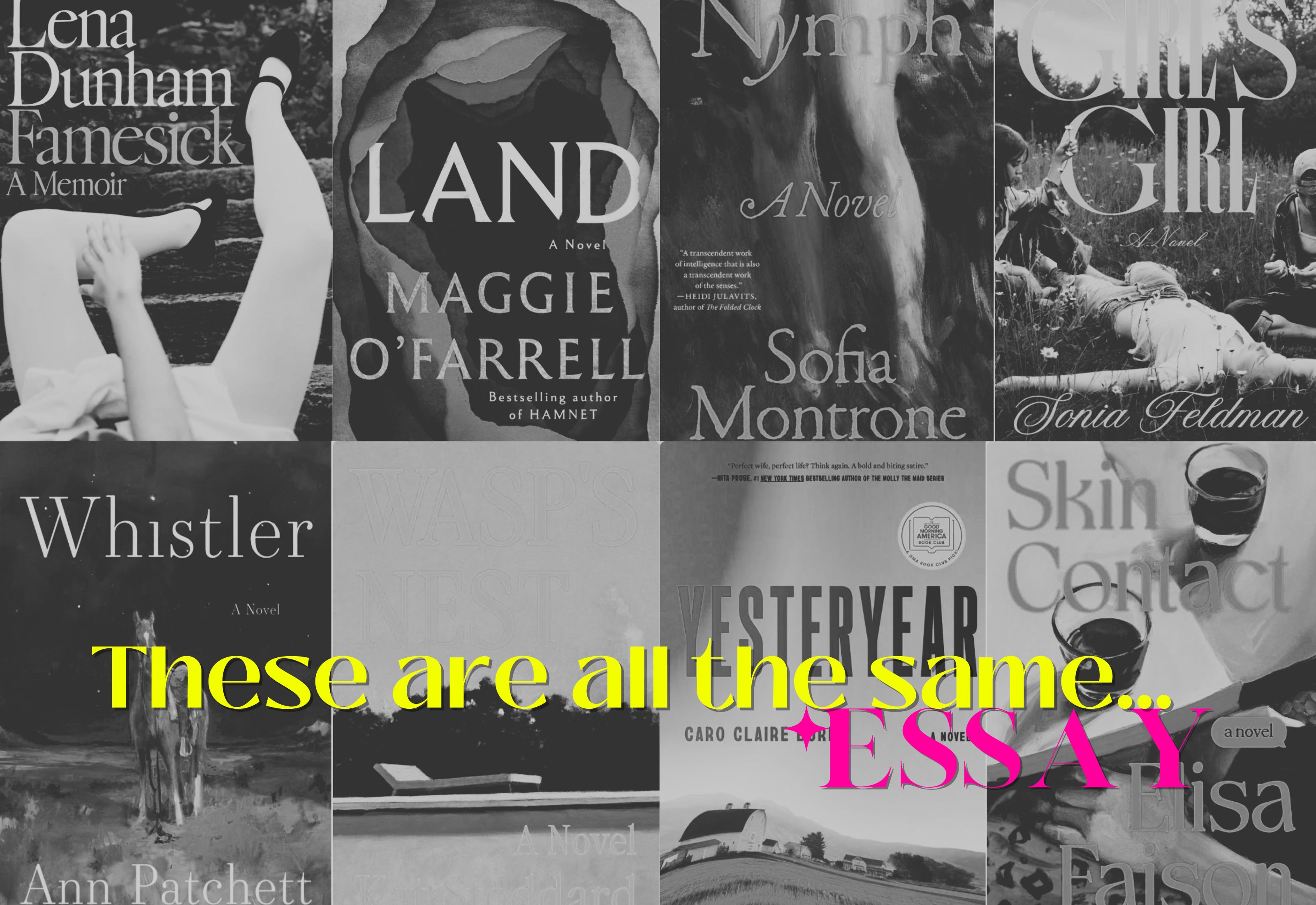
Speaking of romance, you can imagine my dismay when I perused my local Browser Books on Fillmore Street (one of the city’s best indies, part of Green Apple Books,) and after a few moments of simply letting my eyes rove over the new release bookcases at the front of the store I realized…they’re all the same. Just look at what I mean:
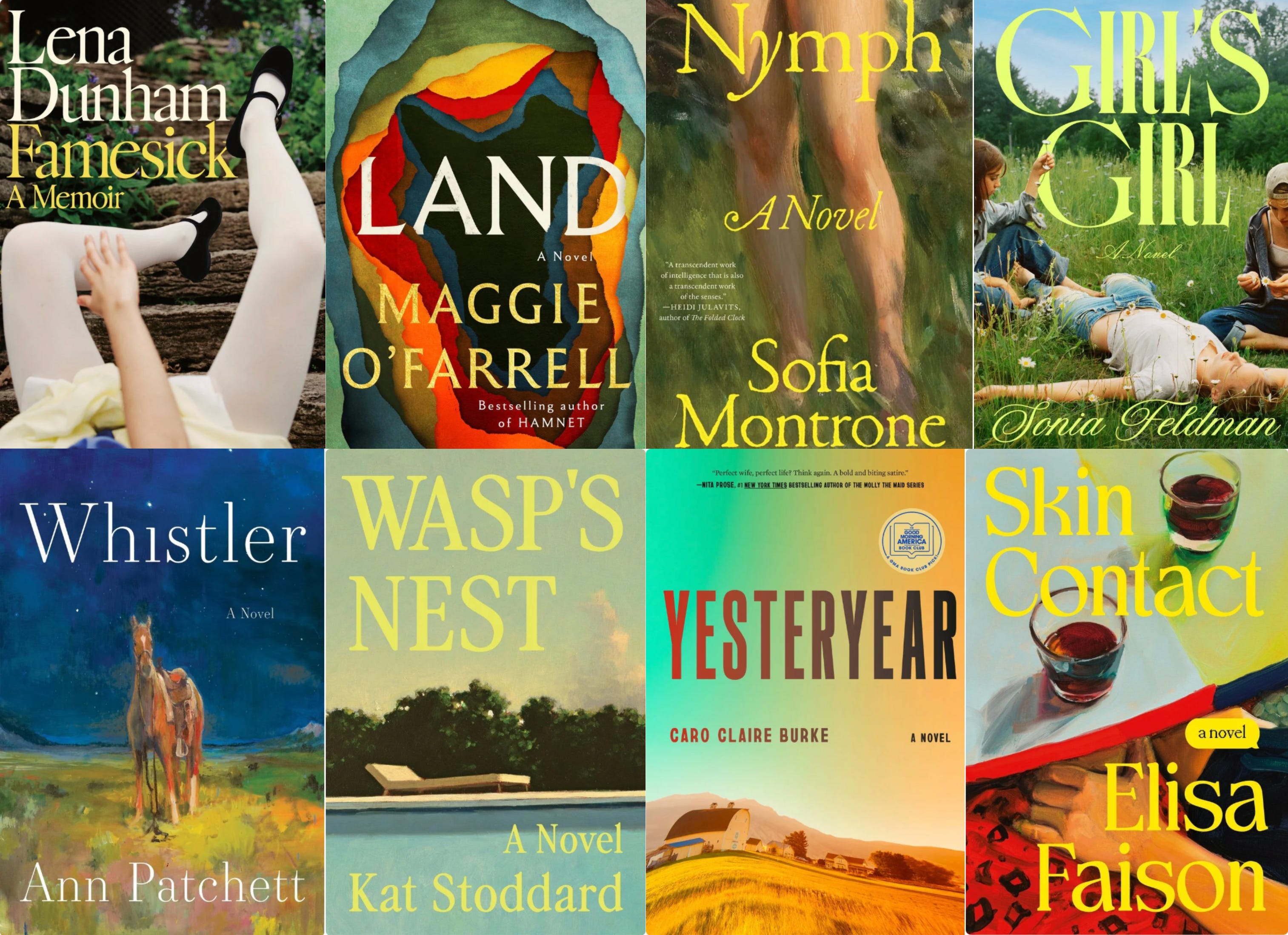
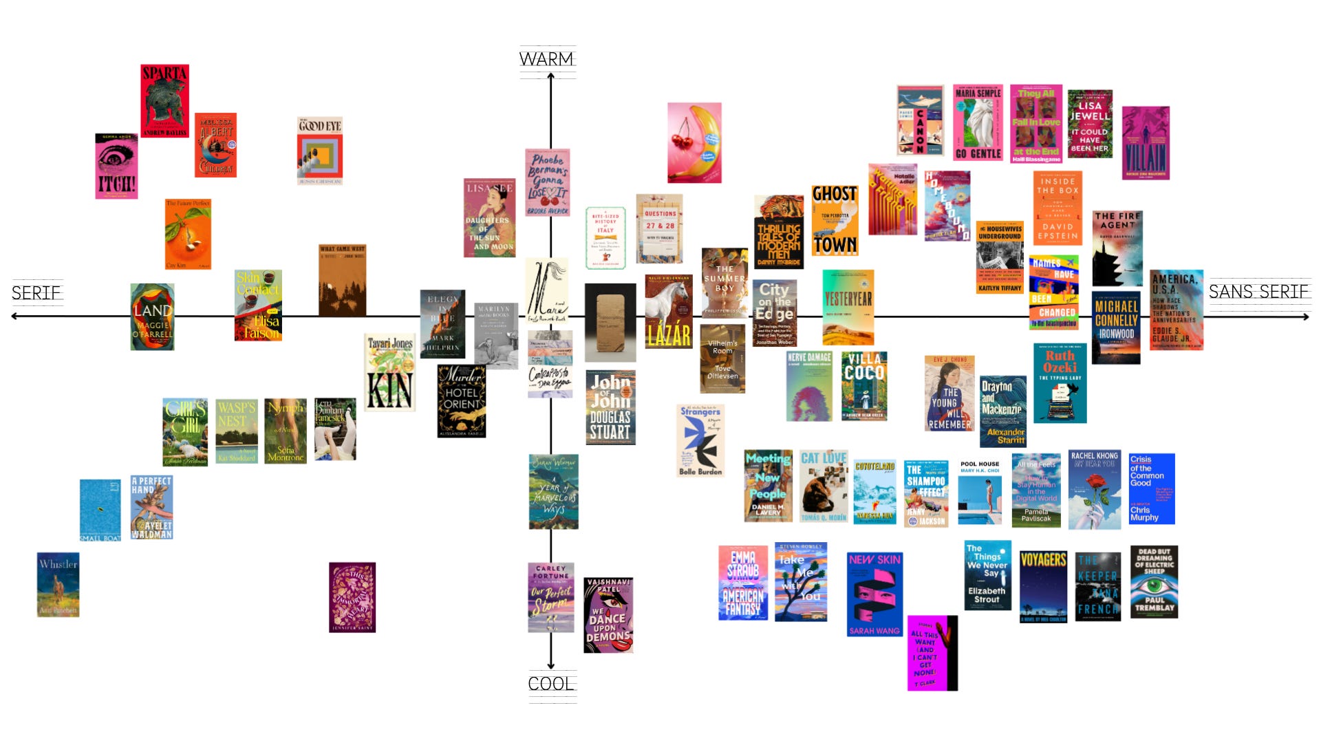
All of these books were positioned near each other and I was stunned by how same-same it all was, even down to the usage of similar serif fonts (with the exception of Yesteryear,) and in similar colors. In fact, all of these covers have a very similar visual tone to them although presumably the stories are different. (I haven’t read any of these yet.) But it wasn’t just this flock that stood out. As with any product or marketing, there are multiple trends at once.
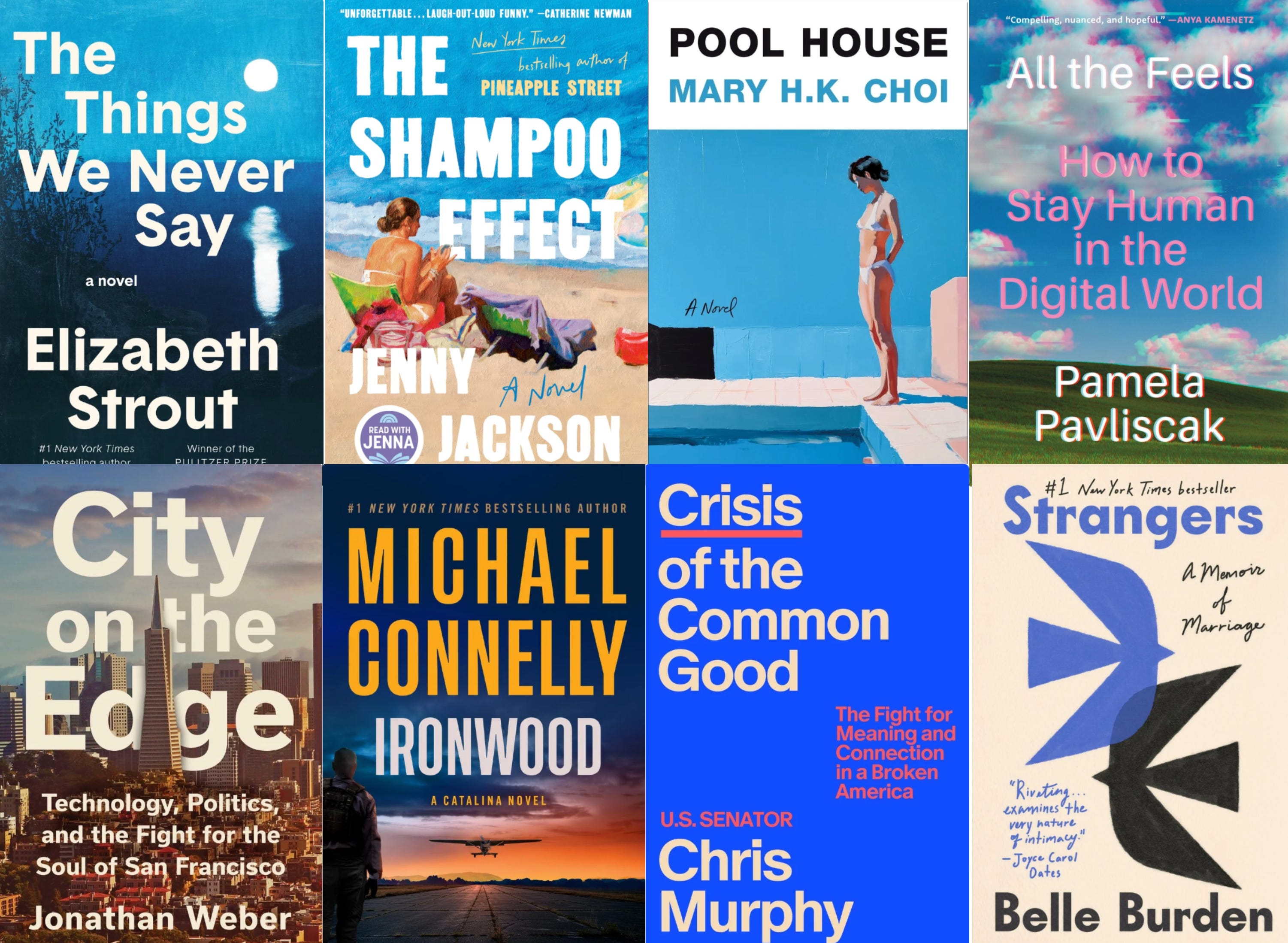
While the first group went heavy into the oversized yellow serif fonts, there’s an entire other school that is deeply serious about sans-serif. I love Helvetica as much as the next person, but there’s an entire empire of fonts out there. Can’t we expand a little bit? Of course there’s always a Michael Connelly book using the stretched vertical font so frequently used on thrillers. This kind of font on a book is telling you at a glance that something bad is going to happen within these covers. It makes me think of mass-market paperbacks in Walgreens, but those books sell in major volume so what do I know?
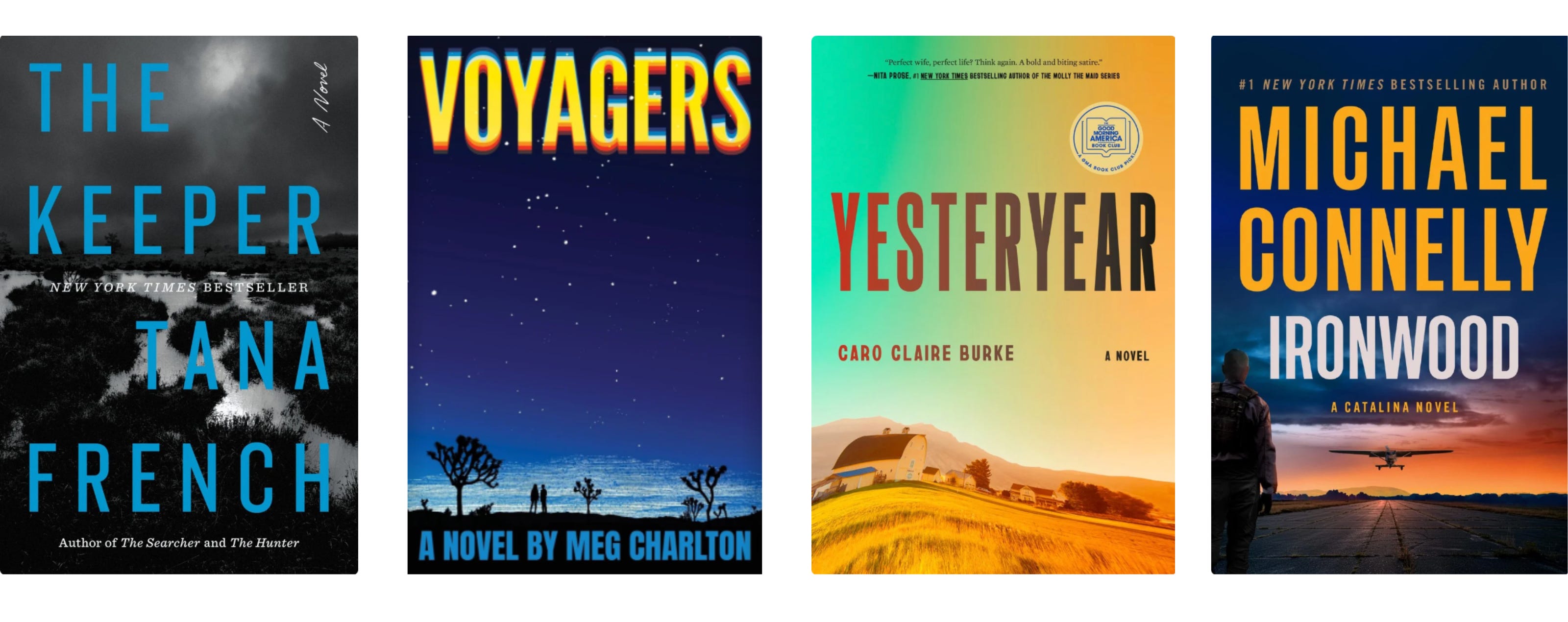
In fact, there were many moments of repetition and sameness throughout the shelves which made me wonder what, exactly these publishing houses were trying to do to us. I made a chart…and then I noticed even more similarities between certain titles too.
And now for the twinsets…they just kept appearing over and over:
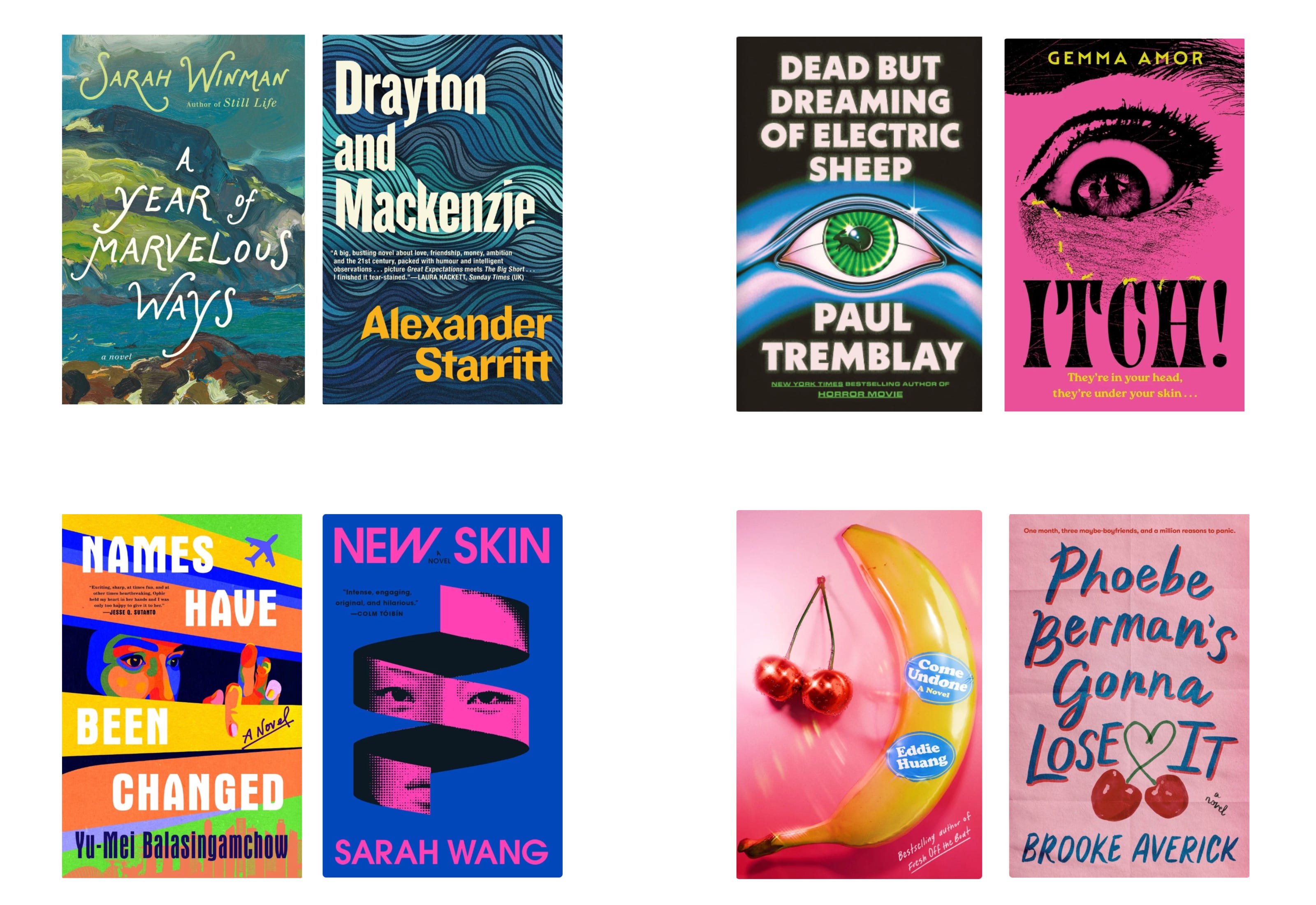
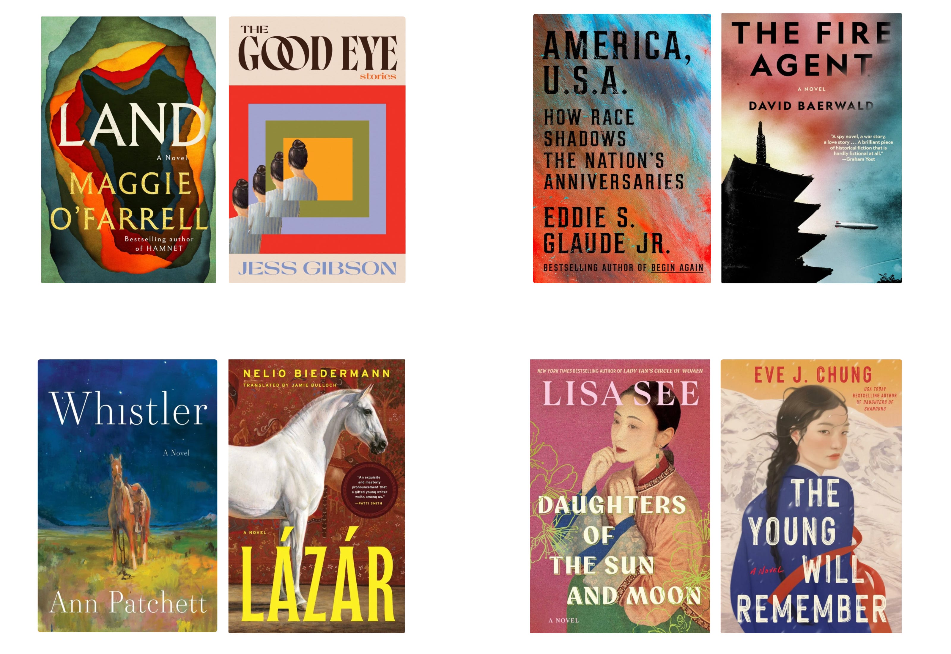
The similarities are sometimes downright unnerving. I get that this may be stretching here and there and that probably most people won’t even see this, but the longer I looked the more they all jumped out at me. Even going back to the beginning, there’s striking similarities beyond mere color and font. Layout, theme, and again the overall tone of these covers are in lockstep.
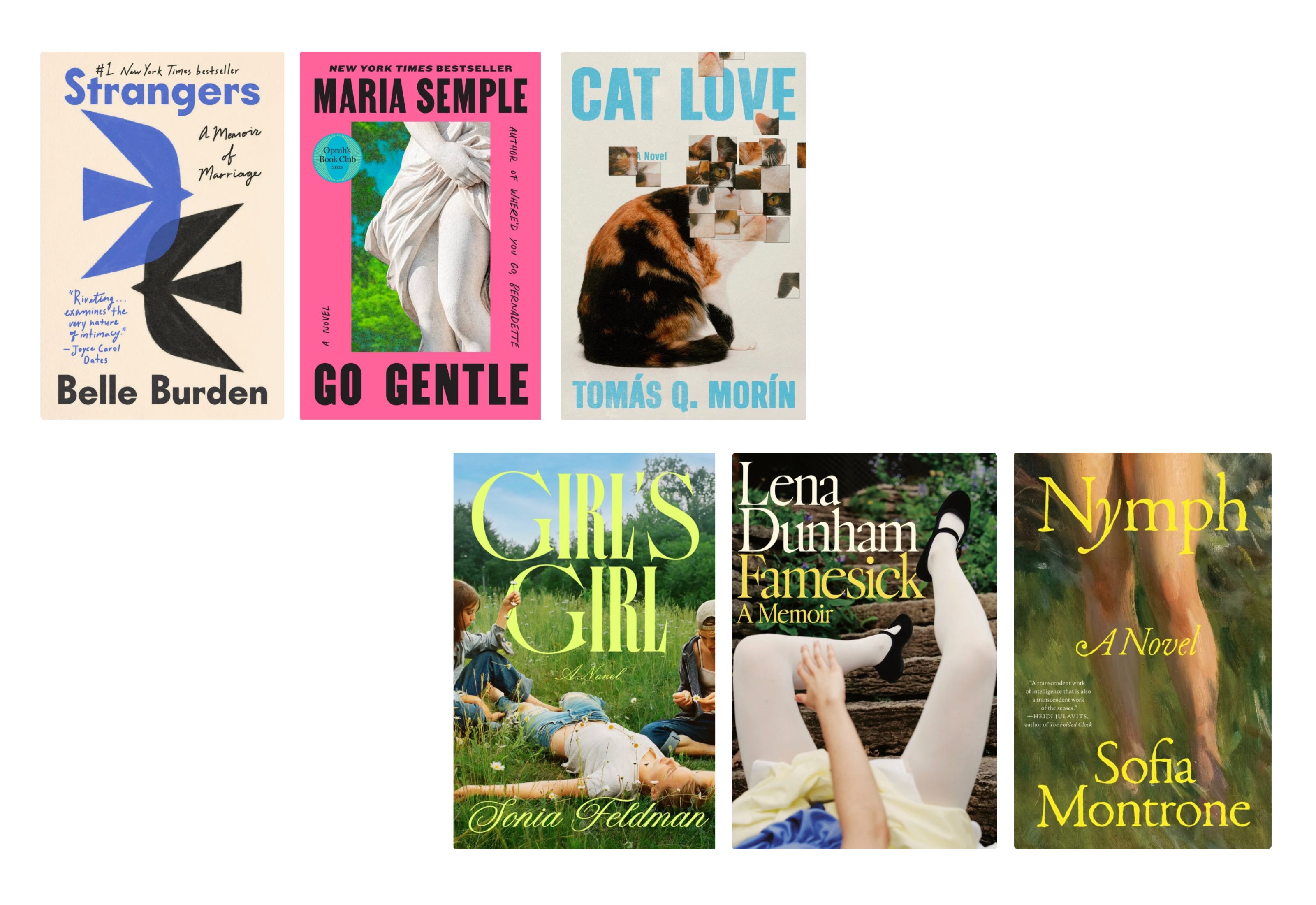
Here the top three have the same sans-serif type of framing, all with a central image. The layout that I thought was an elegant representation of the osprey in Belle Burden’s Strangers now looks like a template. The bottom three are so strikingly similar I can’t un-see it. Girls in the grass, summertime, bodies, innocence…it’s very Sofia Coppola-esque, which is definitely a sale-able, cool-girl aesthetic. That said, for me these three covers are hard to distinguish, which makes me wonder if any one of them is worth reading.
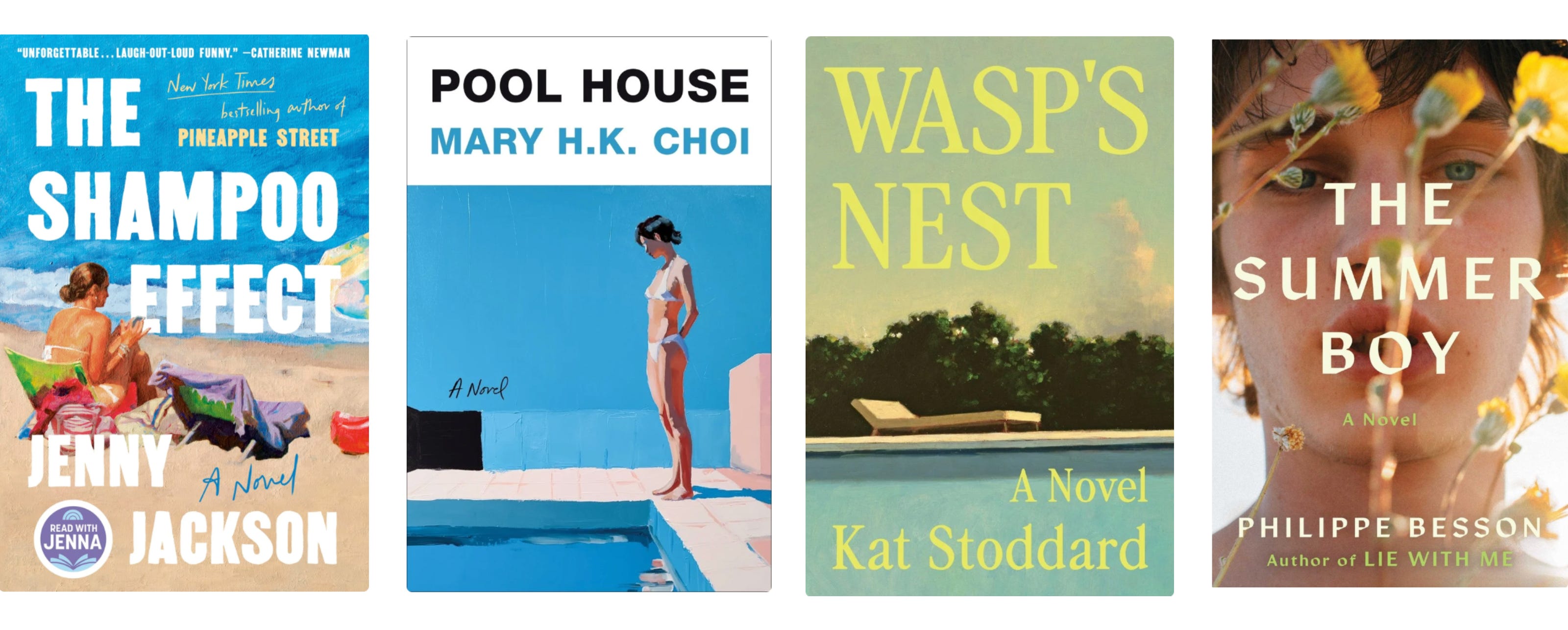
Going further, this set is selling summer HARD. We have a beach, two pools, multiple lounge chairs, and a fey-looking boy lit by golden sunshine. If that doesn’t make you think of Jacob Elordi as Felix Catton, I don’t know what to tell you. I get it, we all want a transporting “beach read” this time of year, but this is slight overkill. I do like the way Pool House evokes a sort of David Hockney-esque vibe, and I do love the still, warm patina given by Wasp’s Nest — that pool could be in Italy, Napa Valley, Ojai, East Hampton — it’s sophisticated and simple, but alongside the rest it loses the effect and just becomes part of the laundry.
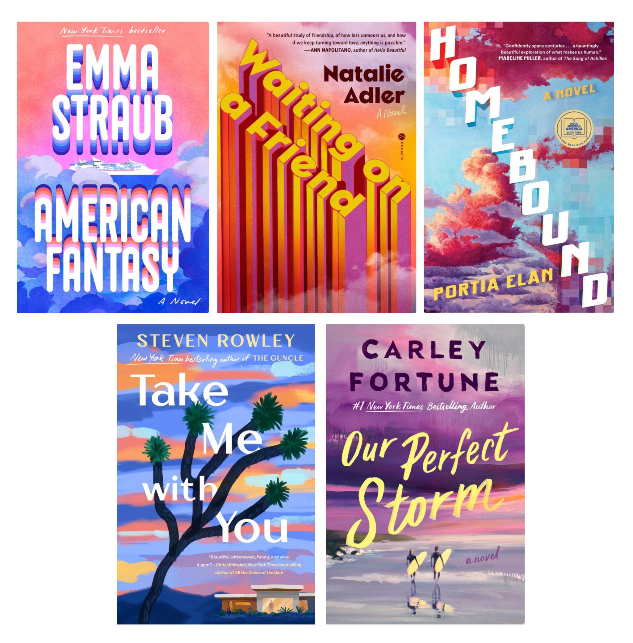
This group…I don’t know. Something about these scream “millennials” to me, but that might be over-simplifying. I’m not sure why pink-orange sunset clouds were everyone’s idea, and they’re pretty in the same way the swimming pools are attractive, but I can’t believe the similarities. The diagonal text in Homebound and Waiting on a Friend is striking, especially given their same coloration. All of these seem to have to do with travel, which is definitely a sought-after topic for summertime reading, but are we really at the cartoonishly pink sky level of disillusionment? I’m sure these books are fine, but which would I choose? By what criteria?
Again, I’m not commenting at all about the content of these books because I haven’t read them (except for Strangers), but just what the cover art was conveying the other day when I was browsing. As products, so many of these books look the same I’m not sure I’d be able to distinguish them. And, distinguishing them is rather the point of cover art, no?
In a 2024 article, Forbes Books Creative Director David Taylor said:
“While artistic expression is paramount, the front cover is also a strategic tool for marketing and promoting a book. In a saturated market, where countless titles vie for attention, an intriguing cover can make all the difference. Will a reader be attracted to this book? Will a bookstore stock it on their shelves?
In those brief moments on a bookshelf, our goal is to ensure the cover design catches the eye of potential readers. The front cover design must stay within genre norms while innovating enough to stand out distinctly.”
Key words there: “saturated market” and “catches the eye”. But what if all the title’s covers look the same? How does one then choose from the group of distinctly non-distinguishable?
According to this article on Penguin Books’ website, there are multiple rounds of iteration for a book cover. From the brief to multiple concepts, multiple iterations between multiple teams before the cover is determined. They say that even more attention is devoted to the spine of the book since that is what is most likely to be seen over the actual cover. Is that why so many covers look the same? Because no one will care once they’re on the shelf?
Something about this visual flattening is irking me, especially in the book industry where many writers are rightly concerned about the prevalence of AI. If we’re so threatened by the banal flattening of AI-generated prose, and we want actual writers to have their work respected and protected, why are we flattening the very thing that distinguishes their work visually? Making cover art indistinguishable makes the work indistinguishable, and that to me sounds like death.
I know these covers have a lot of care and attention put into them. I saw a video where Ann Patchett was discussing the custom painting made of the horse for her cover of Whistler, for instance. And, as a retailer I know sometimes trends are just sort of…in the air, and we can’t stop them. Things come out sort of the same and it just happens that way. But the trend-maxxing of books is concerning. Yes, there are so many books published every year and within genres there will be a lot of similarities, but we need to stay diligent. Yes, I have noticed plenty of books having similar covers over the years; there’s only so many ways you can cover a small-ish object made of paper that has certain design constraints. That said, if the cover art within one season of book releases is so strikingly similar, it makes one wonder how any of us are meant to distinguish our work as we navigate the trend-maxxing era when it’s all too easy to summarize, compare, and categorize in an effort to make sense of things.
Great art doesn’t make sense. Maybe great cover art shouldn’t either.
What are your thoughts? Have you noticed this trend too?


love this, especially with the examples. ‘visual flattening’ such a spot-on phrase. so much of design right now is a lack of risk for fear of people’s reaction (aka keyboard critiques), but book covers should, as you said like great art, invoke thought and intrigue and maybe a little weirdness
This is such an astute observation, beautifully articulated and documented, that gives life to a particular ennui I've been feeling toward book art lately!